


![Junghans Max Bill Automatic Watch 027/4308.02 [PREOREDER - EST ARRIVAL END OF FEB 24]](http://mywow2.com/cdn/shop/files/027_4308_02-1_900x.jpg?v=1703332734)


THE ART OF TIME: MAX BILL AND “DIE GUTE FORM” - BY SEAN LORENTZEN
Plenty of individual designers have gone on to become famous. Design movements from neoclassicism to Art Deco are rightly well-known as well. But only one design school has gone on to become not just a household name, but a cornerstone of a century of design thinking. I’m talking, of course, about the Bauhaus. The clean, minimal approach the Bauhaus taught has found its way into the watch world in a thousand different iterations through a thousand different designers, but perhaps none have put a better personal spin on the style than Max Bill. In decades of partnership with Junghans, Bill provided the world with starkly beautiful designs with a distinct personality.
 Born outside of Zurich on December 22, 1908, Bill showed an affinity for form from a very early age. By age sixteen, he was working as an apprentice silversmith in the town of Winterthur, and after two years he enrolled at the legendary Bauhaus.

Under the leadership and instruction of artists, architects and designers like Walter Gropius, Wassily Kandinsky, Hannes Meyer and Ludwig Mies van der Rohe, the German design school helped give birth to the Modernist movement across disciplines from industrial design to architecture to pottery. By the time Max Bill arrived in 1927, the Bauhaus was already a major creative force in European thinking with a clear and concise philosophy. In short, form must be simple, form must follow function, and mass production does not preclude an object from being art.
In two years of study, Bill took this mantra to heart before moving back to Zurich to work as a graphic designer. By 1932, he had expanded his scope to architecture, building a studio and living space for himself before turning his attention to the avant-garde “Allianz” of Swiss artists. His personal extensions of the Bauhaus theory, the idea of “concrete art”—making pure abstract form, without natural reference and tangible to the common person, quickly took hold within the group. Within five years he led their first group exhibition, aptly named “Neue Kunst in der Schweiz,” or New Art in Switzerland, at the Kunsthalle in Basel.
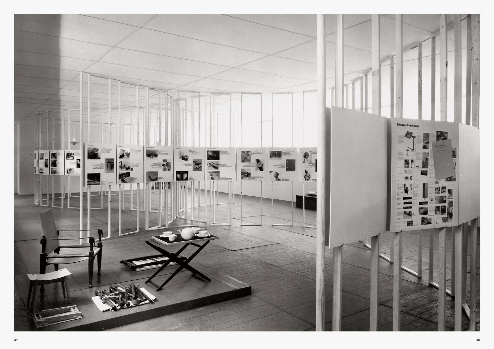
 His rise through the creative ranks continued through the late ‘30s and early ‘40s, and in 1944 he accepted a professorship at an arts university in Zurich. In 1949, Bill hosted a controversial exhibit—aptly titled “Die gute Form”—where he sought to define “good design” to the growing post-war consumer generation. In the years to come, this would be a crusade of sorts for Bill, and in 1953, he founded the Ulm School of Design in Germany to teach his own design philosophy while still working as an industrial designer. The following year, he created what might be his most important work—the “Ulmer Hocker,” or Ulm Stool.
 The Ulmer Hocker might be the ultimate expression of the functional form, consisting of nothing more than three equal wooden sides and a rod. With no more than four basic parts, Bill created an object that could serve as a chair, table, lectern, writing tablet, or shelf element. The simplicity of the Ulmer Hocker also served to show the importance of detail to Bill’s designs. Made of clean polished spruce and joined with a finger joint rather than disrupting fasteners, nothing was allowed to distract from the overall form.
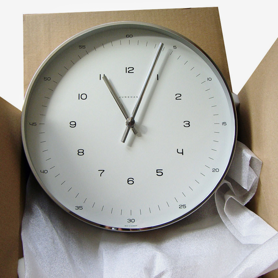
Two years after creating the Ulmer Hocker, Bill found himself courted into the world of horology. Junghans had decided it needed to update its home clock lines with the help of a high-profile designer, and Bill seemed to be the natural choice with his long involvement in German design. Bill accepted the job, and his basic white kitchen clock with seamlessly integrated timer became a hallmark of the brand.
“IT’S A TESTAMENT TO BILL’S ABILITY THAT OVER A HALF-CENTURY LATER THESE DESIGNS STILL STAND OUT AS FRESH, UNIQUE AND WHOLLY MODERN.”
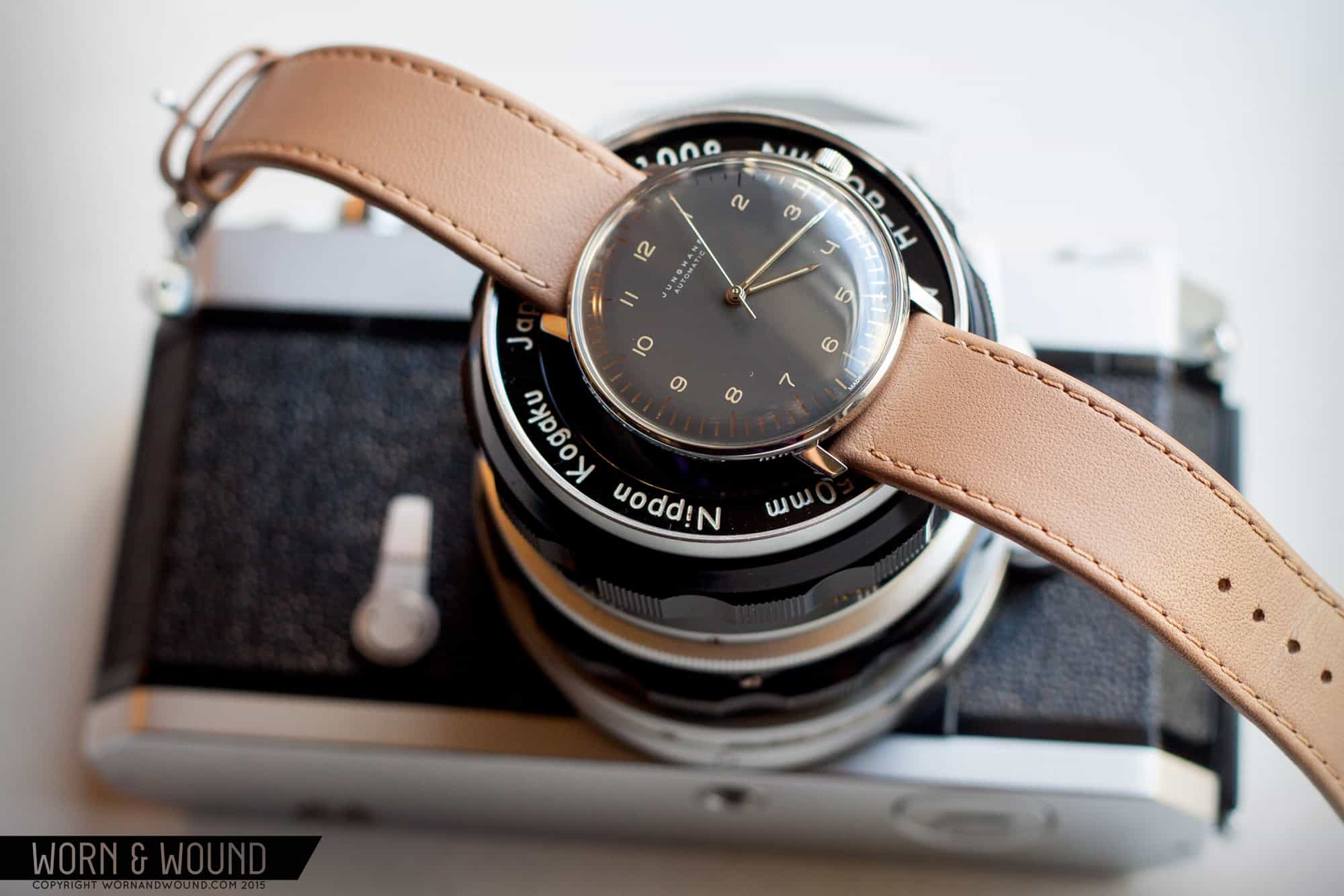
By 1961, Junghans’ relationship with Bill had expanded to the entire brand, giving him creative control over wristwatches as well. The designs he created are still with us today—you can buy a 34mm Max Bill hand winder from Junghans that is nearly identical to some of the early designs from 1961, save for minor dial text, some case differences, and a modern movement. It’s a testament to Bill’s ability that over a half-century later these designs still stand out as fresh, unique and wholly modern. Without knowing, you could easily assume that they’d been penned in the last five years.
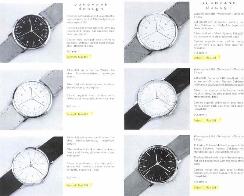
With that said, let’s take a closer look at the most elemental of Junghans’ Max Bill line—the Ref. 027/3700.00. The case design is a perfect application of “concrete art.” Viewed from the side, the domed acrylic crystal merges with the inward curve of the case to create a nearly perfect, continuous ovoid. This oval is punctuated only briefly by the narrow, downward-angled lugs and a small, unsigned pillbox crown at 9. From above, there is zero extraneous detail, nothing but dial, a thin polished ring, and short straight lugs. The case back is the only place where any additional decoration is permitted, and even that is limited to a minimal etching of Max Bill’s signature. Just from description, this may sound dull, or too austere, but like so much of Bill’s work the magic lies in proportion. Every element is perfectly sized to those around them, creating a visual harmony that all minimalists strive for but so few achieve.
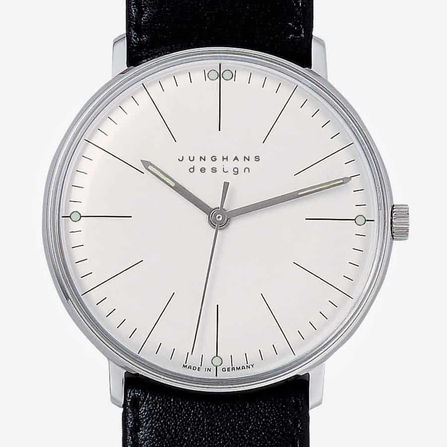 The dial is similarly fundamental. No numerals are present anywhere, and almost nothing but printed elements exist on the face. A light, airy minutes track sits well inboard from the edge of the dial, cut through by long lines extending from the edge to just over halfway to the center. The only other markers of note are modest, eminently functional lume dots at 3, 6, 9, and two at 12. Turning our attention to the handset, the hands are thin lume-filled sticks, ending in sharp points, supplemented by a minimal polished seconds hand. And really, that’s about it.
Once again, however, the beauty of Bill’s design comes alive in the interplay between elements. The point of the hour hand is just exactly long enough to cover the edge of an hour marker, allowing the center line of the hand and the marker create an unbroken line from the edge of the dial to the center. Those hour markers are ever-so-subtly orienting the watch at a glance, with the lines at 12, 3, 6, and 9 being just slightly bolder than the others. In addition, the lume dots on those hour markers are directly centered on the minutes track, creating an implied line directly through the minutes track and creating visual balance. Like the Ulmer Hocker before it, this iconic Max Bill design maximizes function while minimizing form, creating something beautiful in the process.
 The importance of the school of thought Max Bill helped to shape really can’t be overstated. Modernism and Bauhaus-style minimalism have been driving creative forces in painting, sculpture, architecture, graphic design, and industrial design for almost a century, and Bill’s “concrete art” stands as some of their defining pieces. Of these, very few have endured in the public as much as his work for Junghans, and the fact this body of work is still being made today is great news for the watch lover and design enthusiast alike.


